How to improve your home/login page – Company Y – 2014
*DISCLAIMER: UPDATE March 2018. The ‘Y’ brand changed their company services recently. For copyright reason I’m not longer available to share the actual brand/logo image in my website.
A nice home page is very important to promote your products and services. «www.yourcompany.com» will be the first place that people interested in your company, profile, portfolio or product will visit to find out more information about you. The home page needs to introduce the big picture of the company, service(s) or product(s).
A marketing agency website will show samples of their last projects and designs. A social network home page will encourage their visitors to login or sign up for a new account. A financial company will show their services and products for their customers or potential customers and so on.
When I first saw the ‘Company Y’ homepage* before joining the company, I didn’t really understand what was the project about. Enough information about the kind of social network they were, was missing. Links to their main social networking profiles would have helped finding out more about them.
Once I was involved with the project, I was really worried about the homepage. I knew we needed to improve the login process and to provide more information about our products. A new home page was definitely a priority.
You can see in this screenshot below an old version of ‘Company Y’ social network homepage in a 13» laptop.
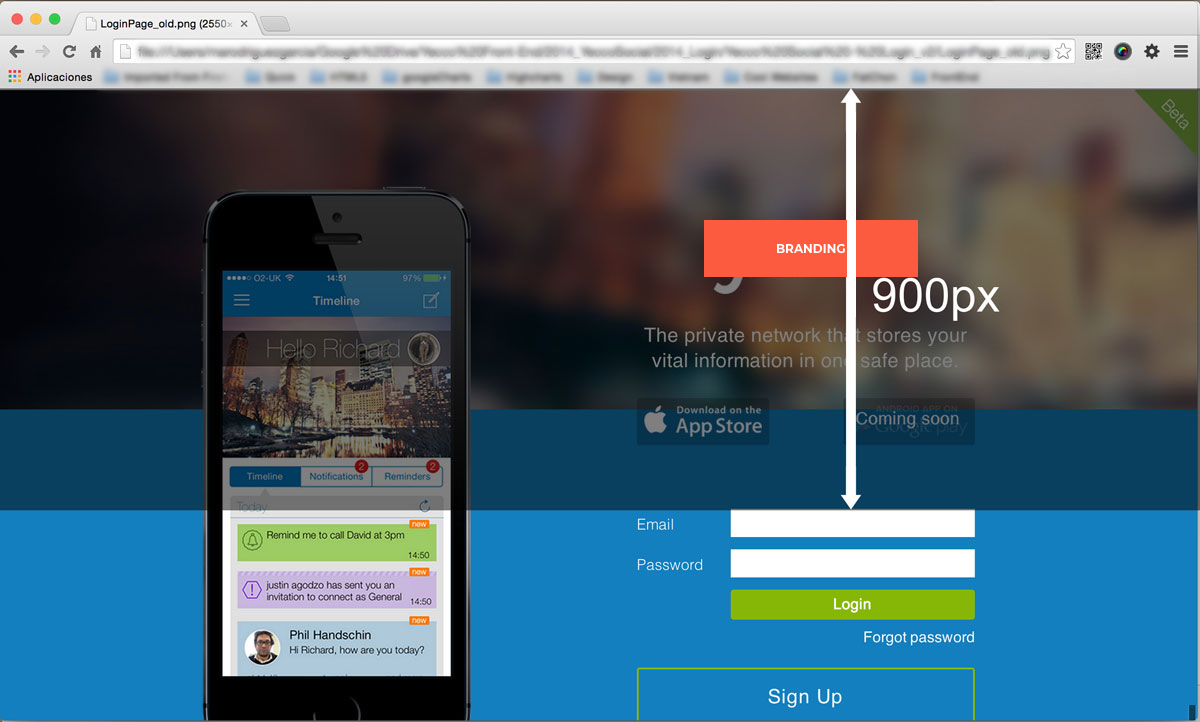
Company ‘Y’ old homepage
The space between the top of the viewport and the login form is quite large for a sign in process. Another issue with this page is that you cannot see more information about what ‘Company Y’ actually does. It means that the «sign up» is not clear because you don’t really know what you are signing up for.
So, I needed to improve this login process and make a good looking home page. At that point, I was working on introducing new features on the web app and on integrating health device readings on the website. So, my deadline was really tight. However, I could (using the same layout) make an improvement on the homepage trying not to change anything but css styles to release this piece of code as soon as possible without side effects on the rest of the website.
Company Y – Login v2
With this version, I highlighted the login form and I brought it to the top of the website. Although this version provides more information about the company and links to the twitter and facebook accounts, the rest of the products were still missing more information.
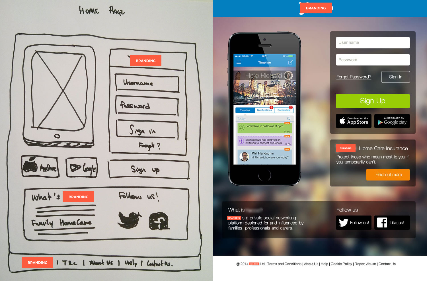
After few months I finally had more time to work on a new design and development for the homepage. So, we finally released a new homepage focused on two different parts.
1. The login for active users
2. More information about the company, our products and our social network profiles.
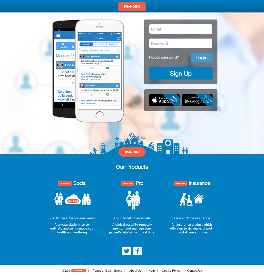
Company Y – Login v3
The login/sign up forms are on the top of the web page as the main functionalities. If you scroll the page down, you will find links to the rest of the products and more information about ‘Company Y’ Social project and the company in the About us page*.
Conclusion to improve your homepage:
1. Highlight the main ACTION/USE in that page
2. Target your audience
3. Show easily more information about your products and services
*DISCLAIMER: UPDATE March 2018. The ‘Y’ brand changed their company services recently. For copyright reason I’m not longer available to share the actual brand/logo image in my website.