Is the ‘state’ half empty or half full? UX tips for empty states
 I’ve noticed that we don’t treat the empty states the way they deserve to be treated ! We barely think that the state of something can be half empty. UXers are optimistic people and we rely on the data to be there. In this post I would like to talk about those edge cases that happen more often than we think and to provide some tips about how empty states can be used in order to see our interface half full.
EXPECTATIONS
Your meeting with the Product Manager has just finished. Right after the brief your head starts imagining how this page, this interface, is going to look like if you arrange the elements and the data in a way or another. You do your research, you find similar examples and then you start designing your gorgeous table with rows full of information or your graph charts with their nice colours and curvy lines.
REALITY
It is very common, as designers, to start filling all our layouts with what we think the content will look like. But the firsts tests with actual data show you that, a real case scenario of the UI does not really match your designs. Usually in data driven apps, UI will differ from what you initially had in mind.
At this point you find out that, actually, a lot of that content might be missing, and your lovely aligned paragraphs are now empty white boxes displaying an ugly ‘NO DATA’ disclaimer. Designers tend to be optimistic people and to always see the state of something, at least, half full.
But keep yourself optimistic! Those empty states can be great allies for your designs, allowing you to create something visually appealing and also to display tips, provide guidance and on-boarding information to your users.
CASE STUDY
To give you some context, I designed a platform that is built on top of Github. The platform it’s meant to provide useful insights to engineers about their repositories and pull requests (lots of data!). After releasing the redesigned UI, I noticed that there may be a lot of different data cases to display (depending on the technology used, programming language, repository itself) that I did not consider in my visual designs.
The UI was displaying awkward information, very long paragraphs and words, errors retrieving information or just a white blank space where I planed to have lots of items… Because of this lack of data, the interface had a lot of blank space and empty modules without any further explanation for users. We also run some user testing and research and some of the users told me that they did not understand why the data was missing and what they could do about it.
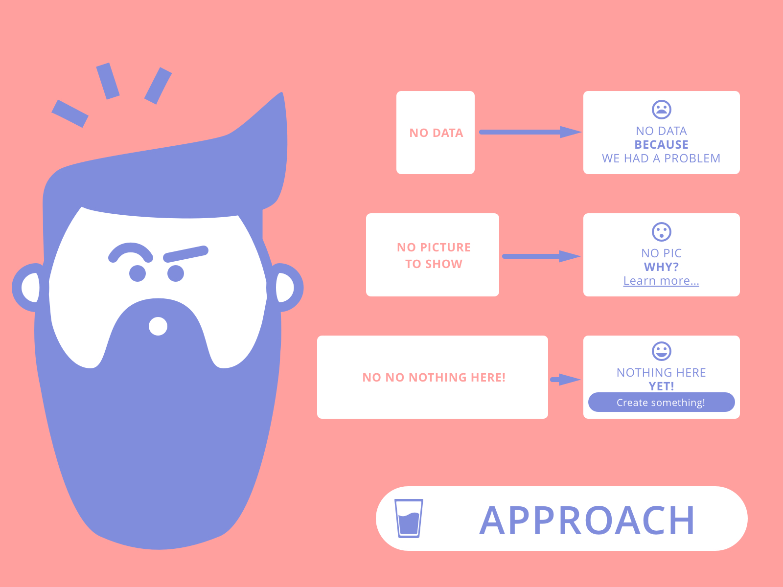
APPROACH: EMPTY STATES ARE HALF FULL!
The UI showing the ‘state’ of the things half or completely empty made me think about a way to fill them with something useful info. The empty states can be an opportunity to provide more context, not only about the missing data, but also to introduce clarifications, feedback, tips, on-boarding to specific functionality…
SCENARIO 1
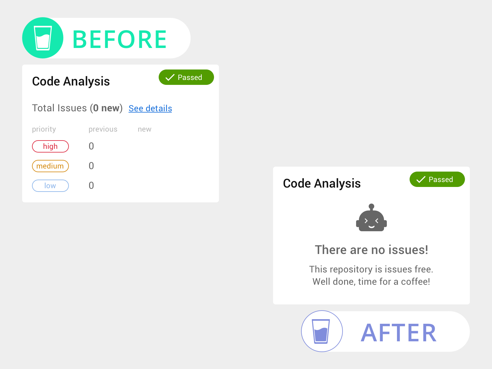
For instance, imagine that you did a great job and your repository have 0 issues in the category A, category B, category C and so on. Instead of displaying a bunch of zeros for the issues section, it would be better to cheer up my users with a ‘Well done!! No issues for this repository’ message.
SCENARIO 2
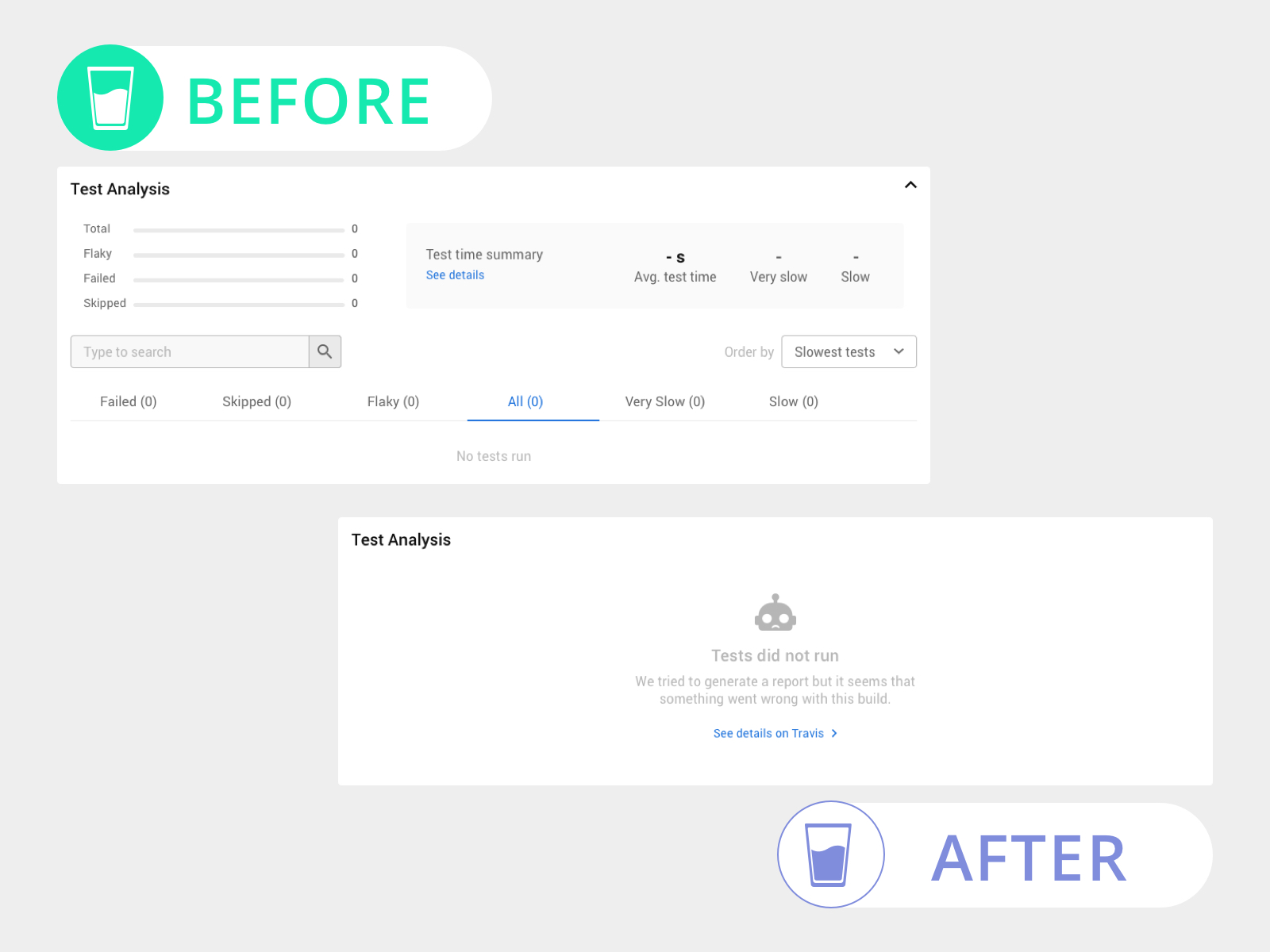
This scenario shows that we’re building a whole UI with no data to display. This is meaningless information for the user. Instead we can tell users that we did not have data but also we can provide a link to the full report in case they want to investigate further.
SCENARIO 3
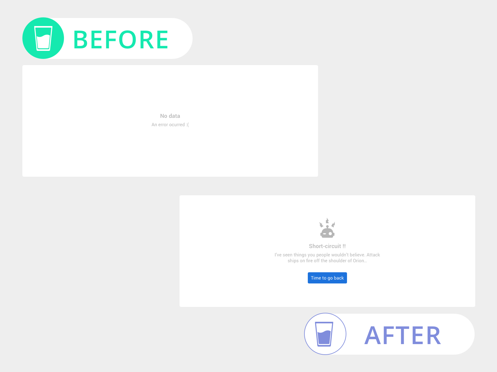
This last scenario is a very common pattern: when you try to load, either a module or an entire page, something goes wrong when retrieving data from the server. In this case we can provide an action for users, for example to go back to a previous page or to reload the page.
Remember that empty states can talk to your users:
– You cannot display data because…
– Nothing here but ‘Learn more about it’...
– This action cannot be performed but ‘you can try this instead’
I hope that these tips can help you to improve your product and remember to look at the ‘state’ half full, no empty space needs to be useless anymore.


