How to improve a login process in your mobile app – 2013
The login process is a simple task that you need to do few times a day when working with computers. Nowadays, most of the websites or apps we are using keep our usernames and passwords saved and encrypted. If you don’t clean up our browser’s cache and cookies or log out, you won’t even need to introduce our credentials anymore.
Improving a user experience in a login process can be quite difficult if you don’t have much to improve, right? Even though the user already knows how to log in on a platform, as UX designers, we need to keep this process simple and clean.
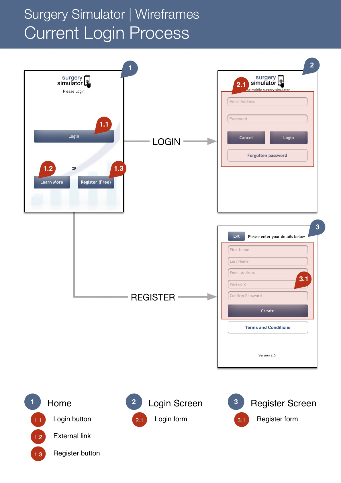
When I first tried the «Surgery Simulator» app I found the login process quite confusing. As you can see the home screen doesn’t allow you to directly login. You know that the user will probably find out how to log in but why would you take it for granted? As UX designers we cannot expect they will figure out how to do it by themselves.
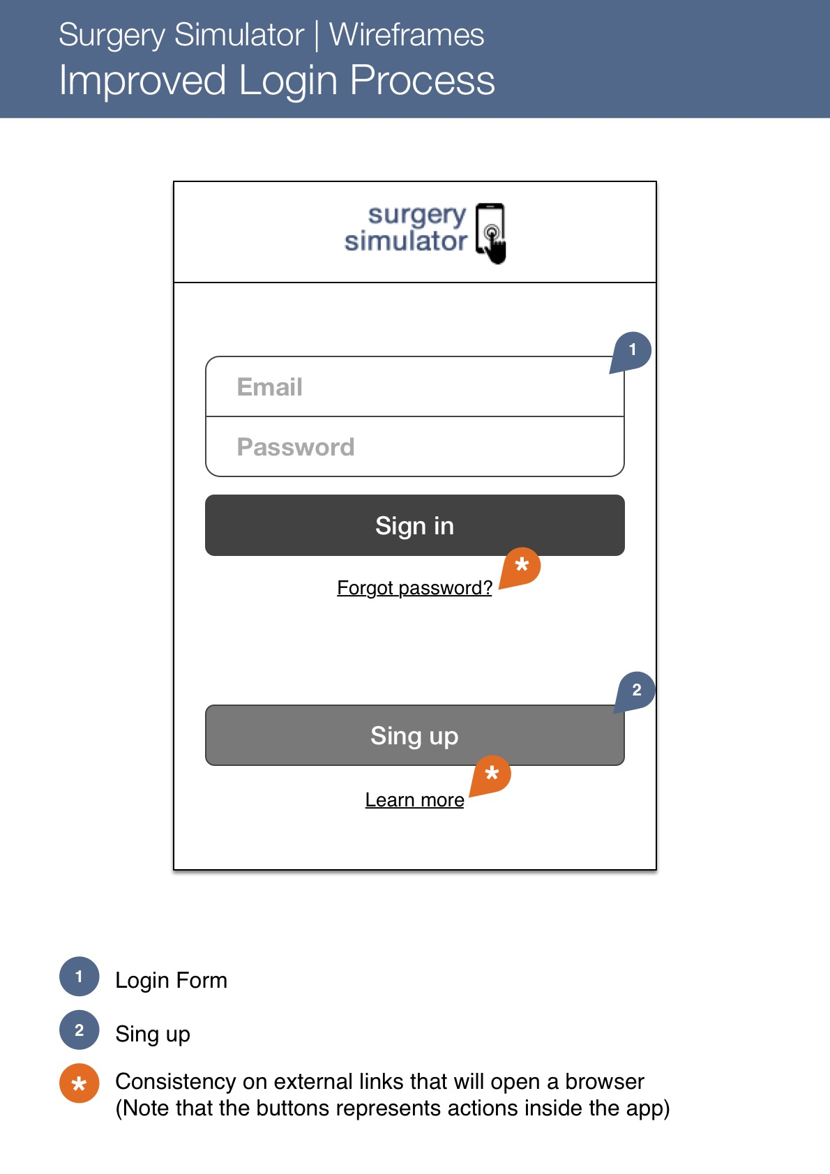
My deadline was quite tight and I just wanted to keep the login process as simple as possible. So, the solution simply was to have a clean and common login form.
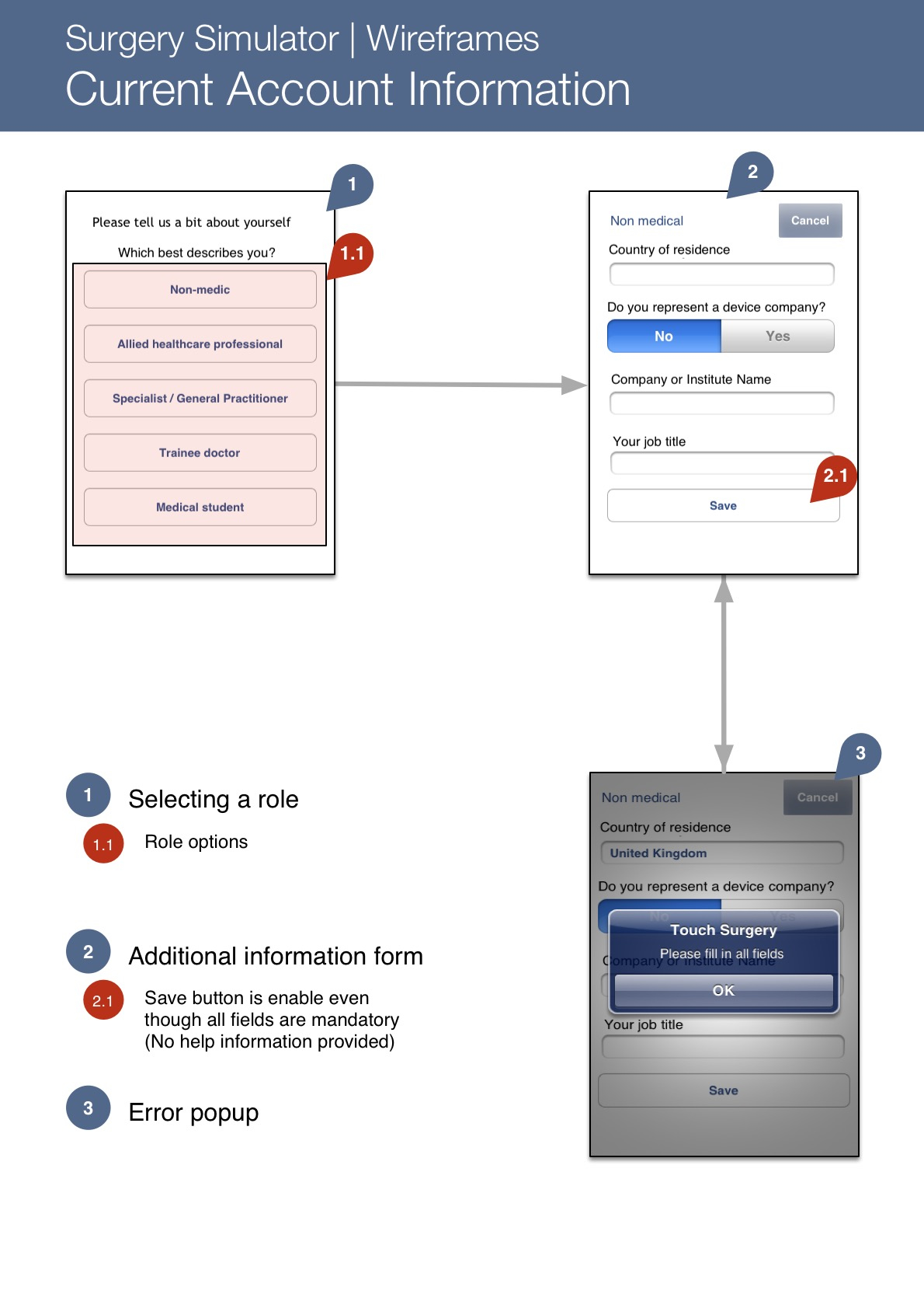
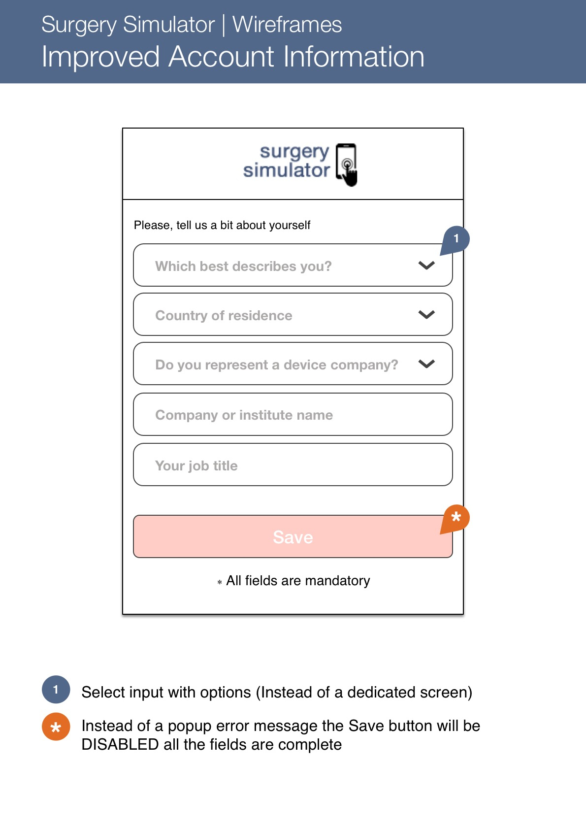
Another part of the app that was confusing was the Sing Up process, also used to update your profile information. You can see in the screenshot below that to display the information properly it is better to follow some mobile app conventions instead of making your users tapping the screen more than needed.
Once again, by tidying up the form, you can use the space you have in a most optimal way and let the app handle the options for your select inputs or take advantage of enabling/disabling some functionalities to avoid error messages.
You can find the whole PDF wireframe in this link. I also find this post with some tips to enhanced your login process really interesting.


