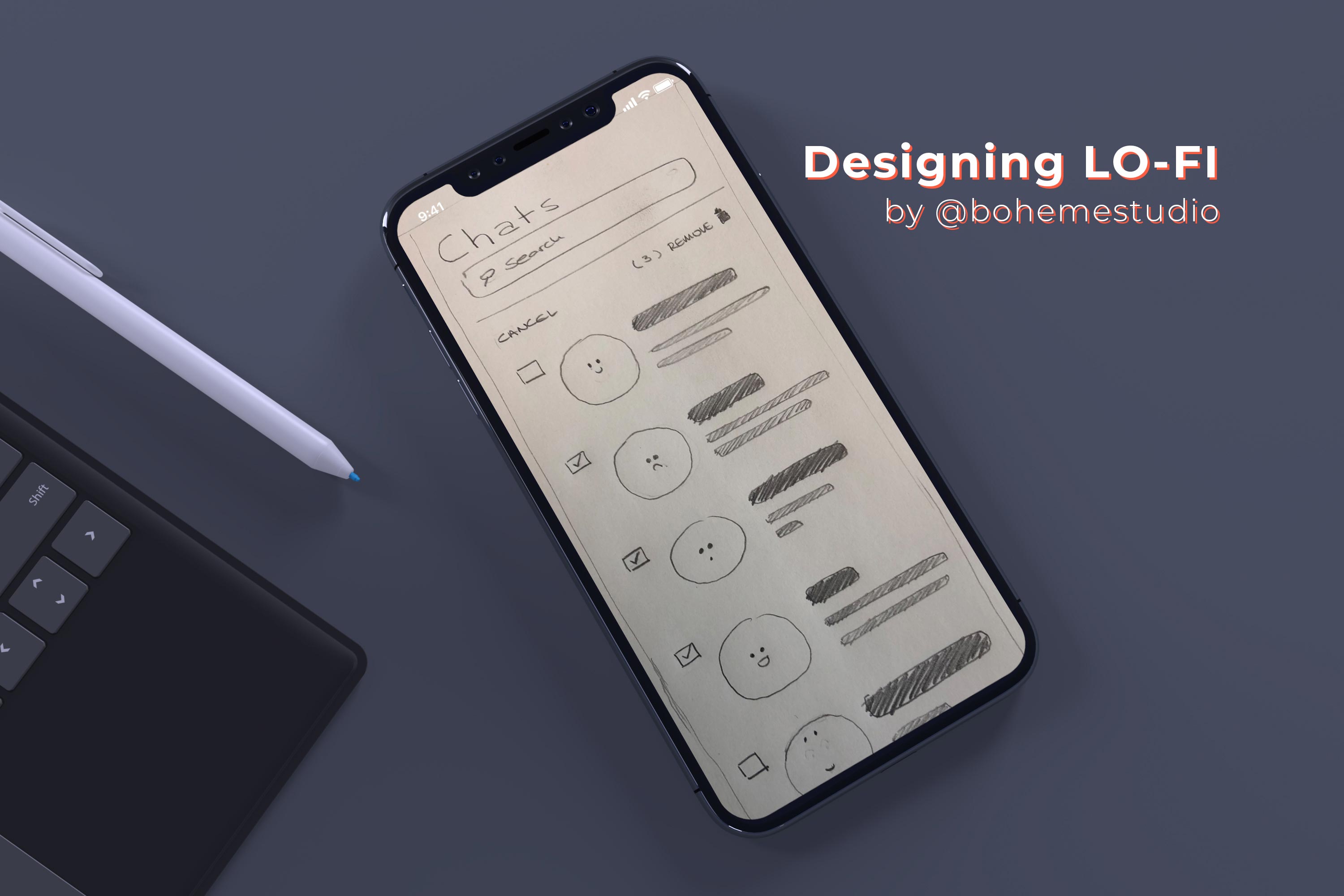
Designing Lo-Fi
When you want to get some feedback about a new element added to your interface, designers tend to re-use existing mockups to speed up the process. This is certainly a time saver but the risk in doing so is to lose the focus, in terms of what you want to receive feedback about, in the first place.
Recently I have been working on including a new bulk functionality in our chat tool. I realised that integrating this new interaction with the rest of the existing UI design was actually distracting my colleagues. They could not actually say what was new in the design and I needed to be very specific about the bulk functionality I was trying to collect feedback about. So I ended up going back to the basics: to pure handwriting sketches and you know what? that worked much better and got me the feedback I was looking for. I will share with you in this article few tips to know when and why to design lo-fi.
When and Why
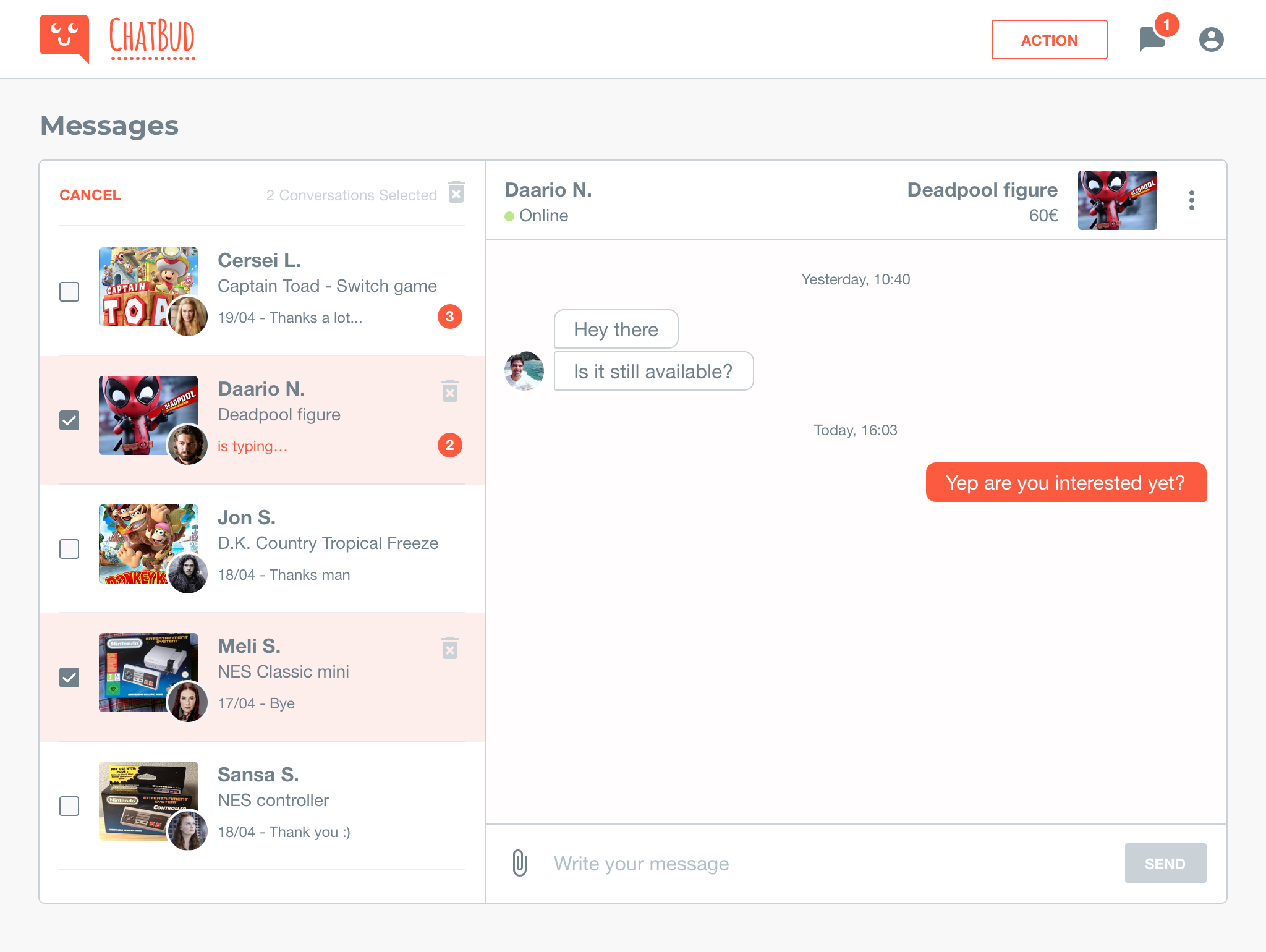
Designing Lo-fi (by bohemestudio) – Illustration 1
Checkout the design above (Illustration 1). If I tell you that I have been working on BULK DELETE ACTIONS, could you tell me what’s new with the interface?
If I ask for feedback showing a mockup like this, you might think the job is done. So, that brings up the first question:
When?
You should try to use lo-fi designs when you clearly want to show that something is a work in progress. At this point of the design process, I am aiming to get feedback about my ideas, the impact of the new interactions in the interface, the usability, etc…
Wireframe it up!
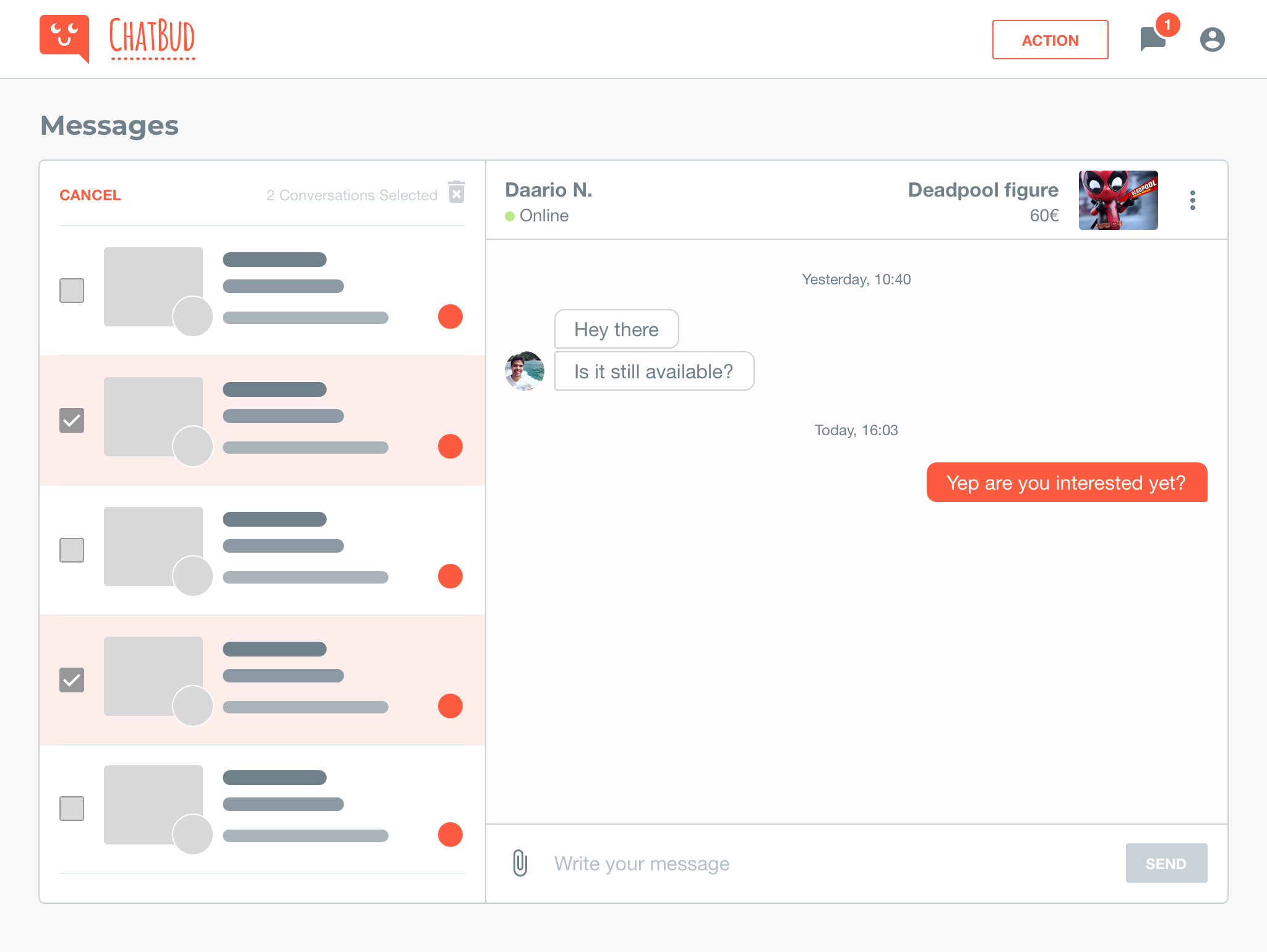
Designing Lo-fi (by bohemestudio) – Illustration 2
Now checkout the design above (Illustration 2), with a lo-fi approach. This mockup leads us to the second question:
Why?
If I show a more developed design (the example on the Illustration 1), the feedback received can divert from what is expected. That is why by sharing a wire-framed mockup I assure that the focus is on my bulk delete functionality and emphasizes the idea of a work in progress.
Define context with no context
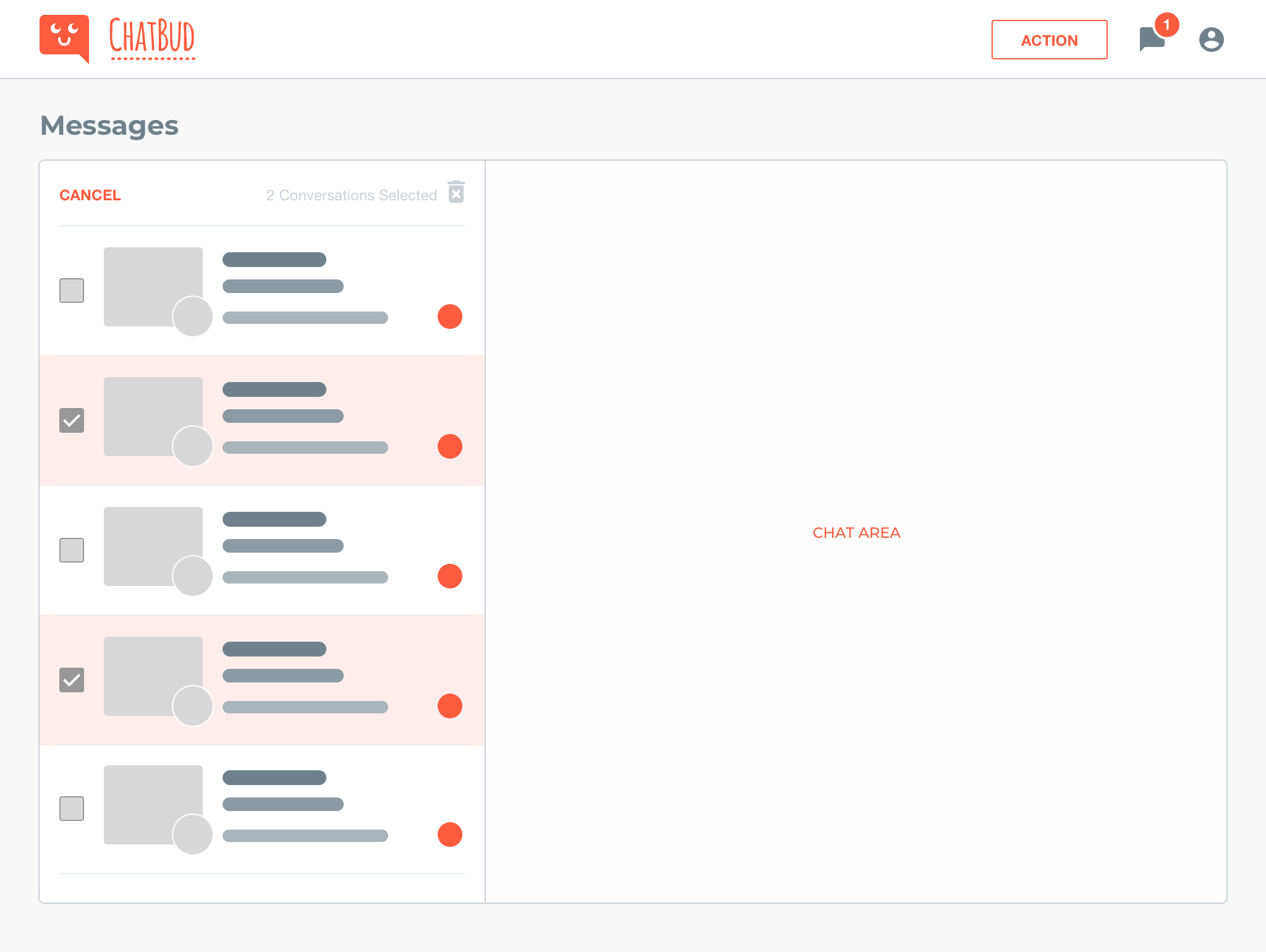
Designing Lo-fi (by bohemestudio) – Illustration 3
You can even remove unnecessary elements from the mockup. We want full attention on the bulk actions. The rest of the items are part of the context of course, but are they necessary to get feedback about our main subject? (see Illustration 3)
Sketch
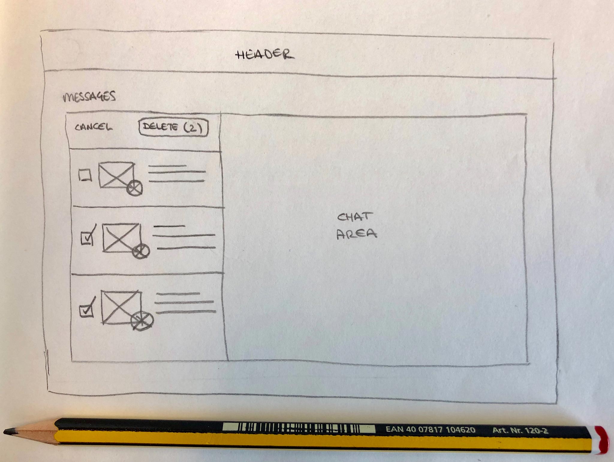
Designing Lo-fi (by bohemestudio) – Illustration 4
Sharpen your pencil!
To collect even more valuable feedback just sketch your ideas out!
A sketched design will encourage people to think about that ‘functionality’ without any noise that other elements would add (Illustration 4). This is very useful in the first iteration for something new in your interface.
I hope these tips can help you get better feedback. Remember to focus all the attention in what you really want to test.