Connections Wireframes – 2014
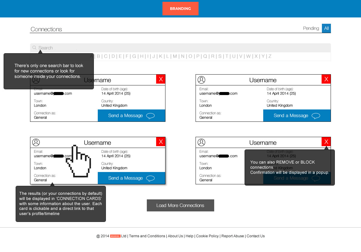
One of the most popular features in social networking is the way you look for connections. Those connections can be already in your network but they can also be in the entire network.
These features need to be quite simple for the user experience. Probably after the first search for a contact you will need to add filters in order to be more accurate in what you are looking for.
Those filters, depending on the requirements, need to be accesible and easy to use and understand. Keep in mind that offering different filters to look for content should be intuitive. However you don’t want to overwhelm your users with hundreds of options.
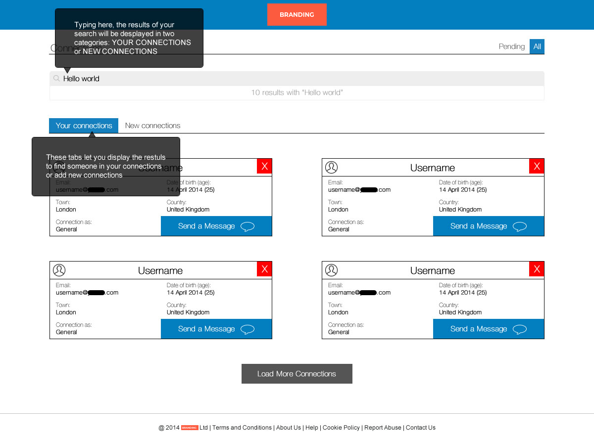
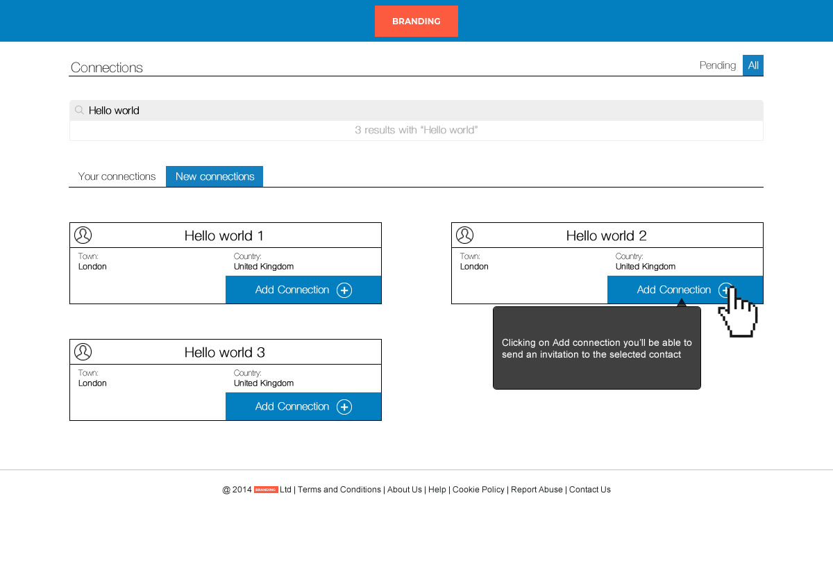
Obviously the profile picture will give you a big clue to know if your search was right or not but sometimes users do not have a profile picture. Users may be lazy or just don’t want to share too much personal information on the network. Some tips trying to bring the right information in the first search will be to present the results in two lists. Users that are already in your network and users that are not.
We have seen that it is common that these two lists/tabs don’t make too much sense. The reason is that your first search criteria has filtered lots of the results in your connections. If so, the result will be just one list with your connections at the top.
Anyway, if you need to split your results or not, it is important to also understand which user’s data will be necessary to display to ensure we have enough information to identify the user we are seeking.
Connection’s information top 3:
- Profile picture
- User name
- Geolocation


