Branding – Company Y Insurance – 2014
*DISCLAIMER: UPDATE March 2018. The ‘Y’ brand changed their company services recently. For copyright reason I’m not longer available to share the actual brand/logo image in my website.
The brand image is something you have to keep across products. Consistency is really important for users, even if they are visiting different websites for the same company, that consistency will tell them automatically they are watching something that belongs to a certain brand.
Let’s think about a company that builds a website to promote one of their new products. This product can be really different from the main business in the company (e.g. a wearing company launching a perfume or a software company launching a new watch).
In web design this consistency starts with an Style Guide.
When I first started designing the Company Y* guidelines and the brand image, I wanted to keep consistency between the different projects with logos, colours, fonts but also adding a common browsing experience.
Company Y Insurance – Old web
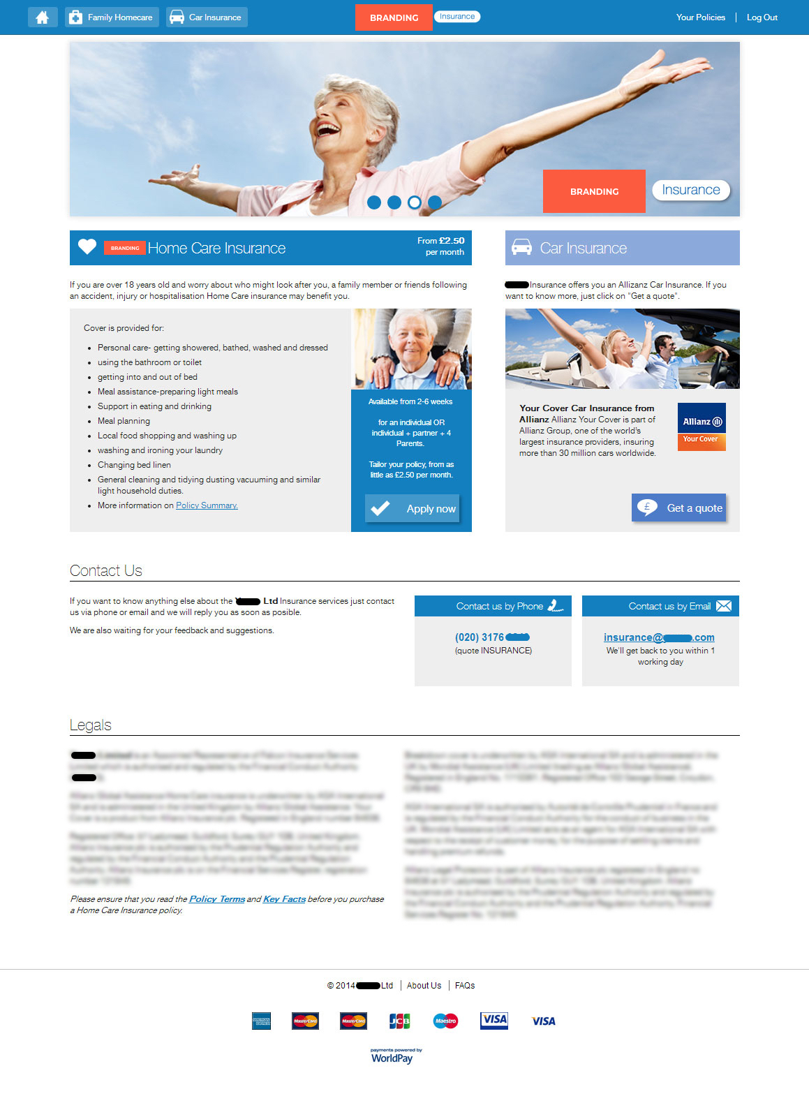
As you can see, the original homepage was a little bit messy, without a clear brand image and we are talking about an insurance service website, so the customers need to trust the company if they are going to spend their money for it. A website like this needs to be clear in terms of legal conditions and need to constantly provide information about the company, phone numbers, email addresses in case there is a problem, etc…
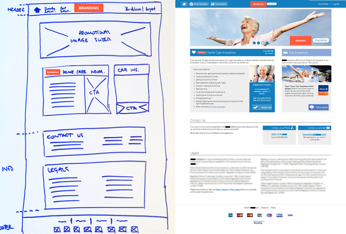
Company Y Insurance – New website – Wireframe
*DISCLAIMER: UPDATE March 2018. The ‘Y’ brand changed their company services recently. For copyright reason I’m not longer available to share the actual brand/logo image in my website.
-
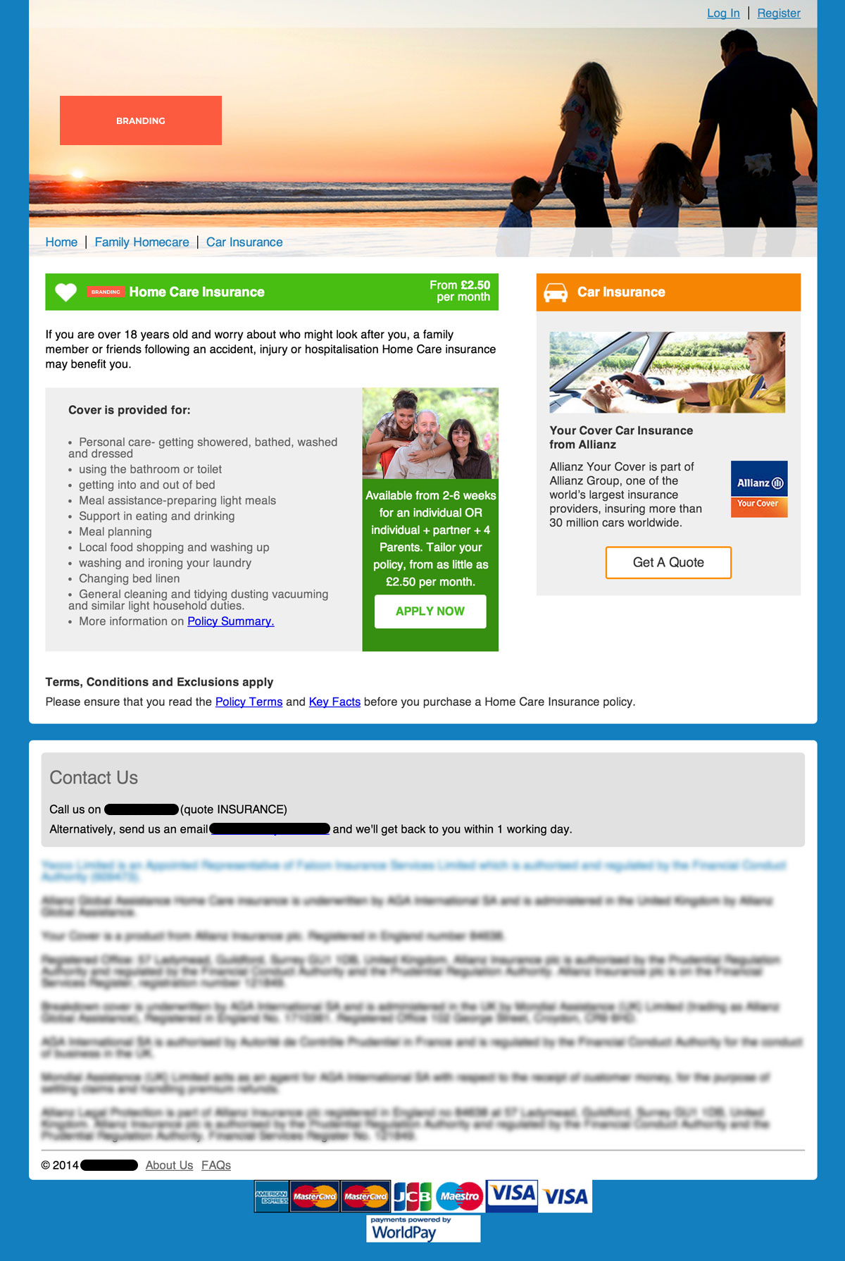
- Company Y Insurance – New website
-

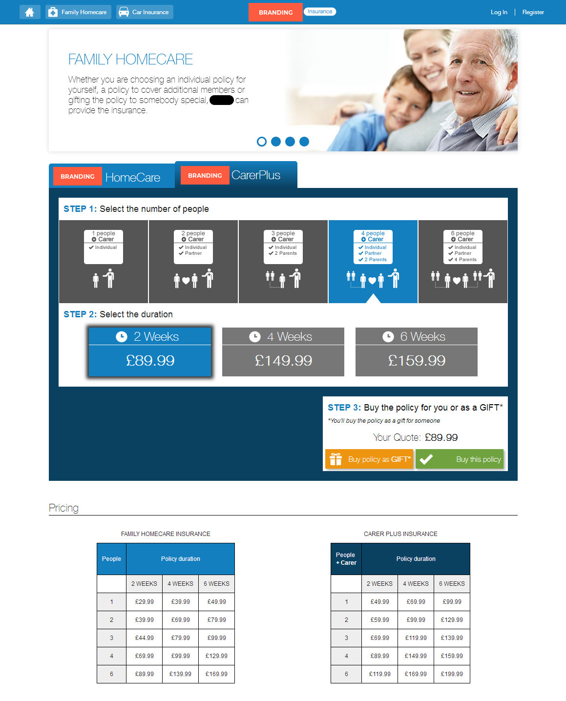
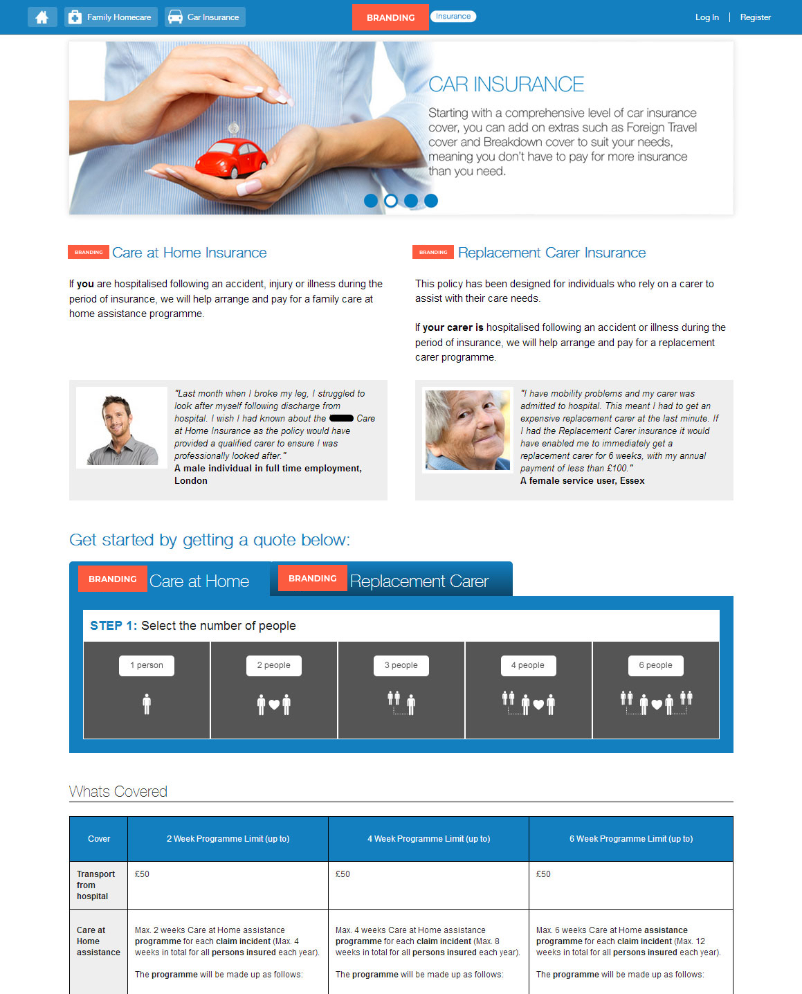
- Company Y Insurance – Products 2
-
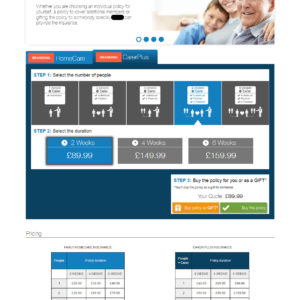
- Company Y Insurance – Products 1