Fluid interface Prototype – 2013
When you are designing and developing a website, it is very important to focus your work on Web Usability. In UX design, this is a basic concept, yet not easy to achieve. This is why it is crucial for any project you are about to start.
But your website can be used in several different ways: a desktop computer, a tablet or your game console browser. These are three different ways to visit a website or webapp and very different user experiences to interact with the website: a mouse, your fingers or a game controller. You have to think as a user and try to deliver a good user experience whichever way they are interacting with the interface.
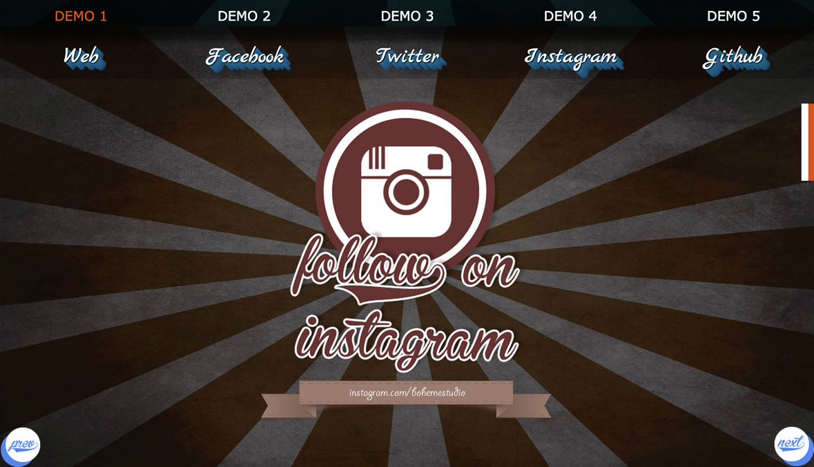
Based on this idea, I built a demo that has a fluid interface that will adapt itself to any screen resolution. It tries to keep the same experience across different devices and screen resolutions.
1. Fluid layout (responsive)
2. Easy navigation.
3. Fully HTML5 and CSS3 implementation.
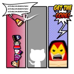
You can see some of the CTA link designs, old school or comic based, used in the demo:
- Retro Design 1
- Retro Design 2
- Retro Design 3
- Retro Design 4
- Retro Design 5
- Comic Design 1
- Comic Design 2
- Comic Design 3
- Comic Design 4
- Comic Design 5
Click here to see the live demo.


