bohemestudio evolution (VI)
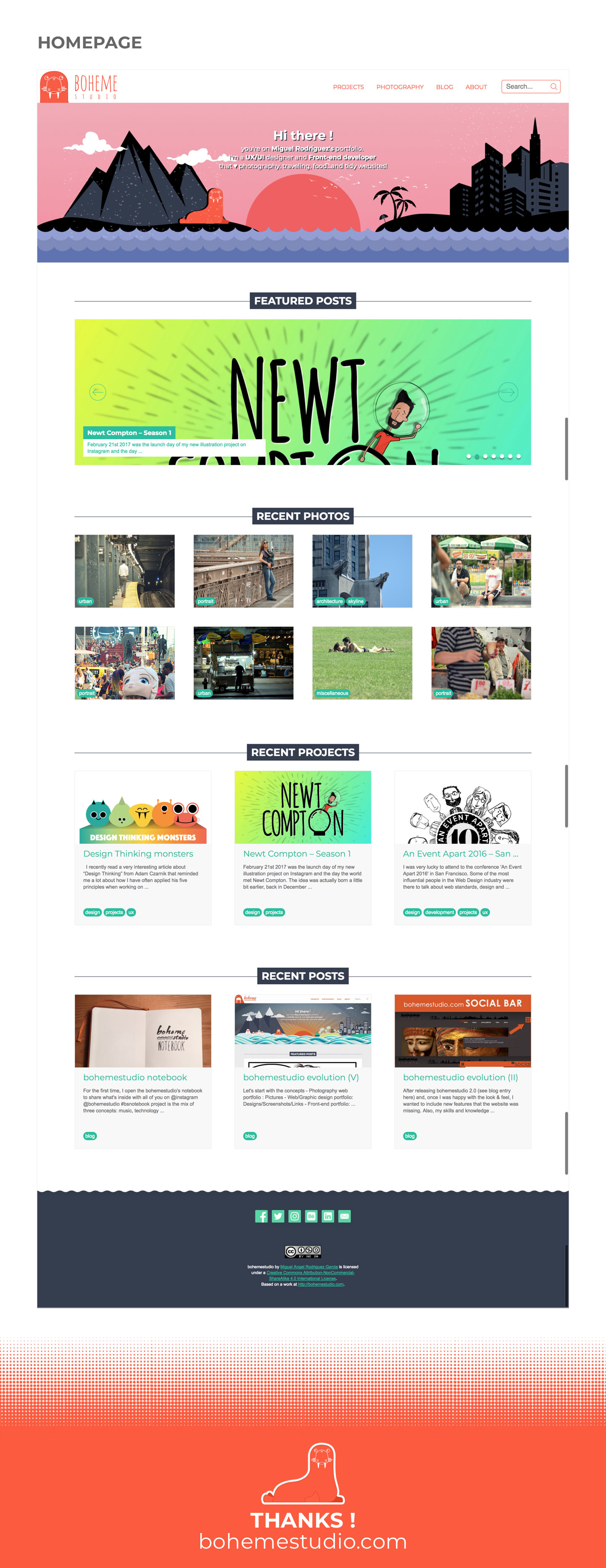
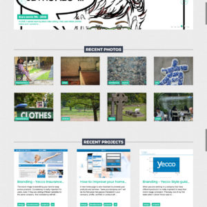
Three years after launching bohemestudio 4.0 I wanted to renew a little bit the look and feel of the website. I did not want to include massive changes, specially UX and interactions in the page which I think it performed pretty well so far. The sticky header and a universal search make all the content accessible and I’ve also worked to include suggested pictures and content while you’re browsing the site.
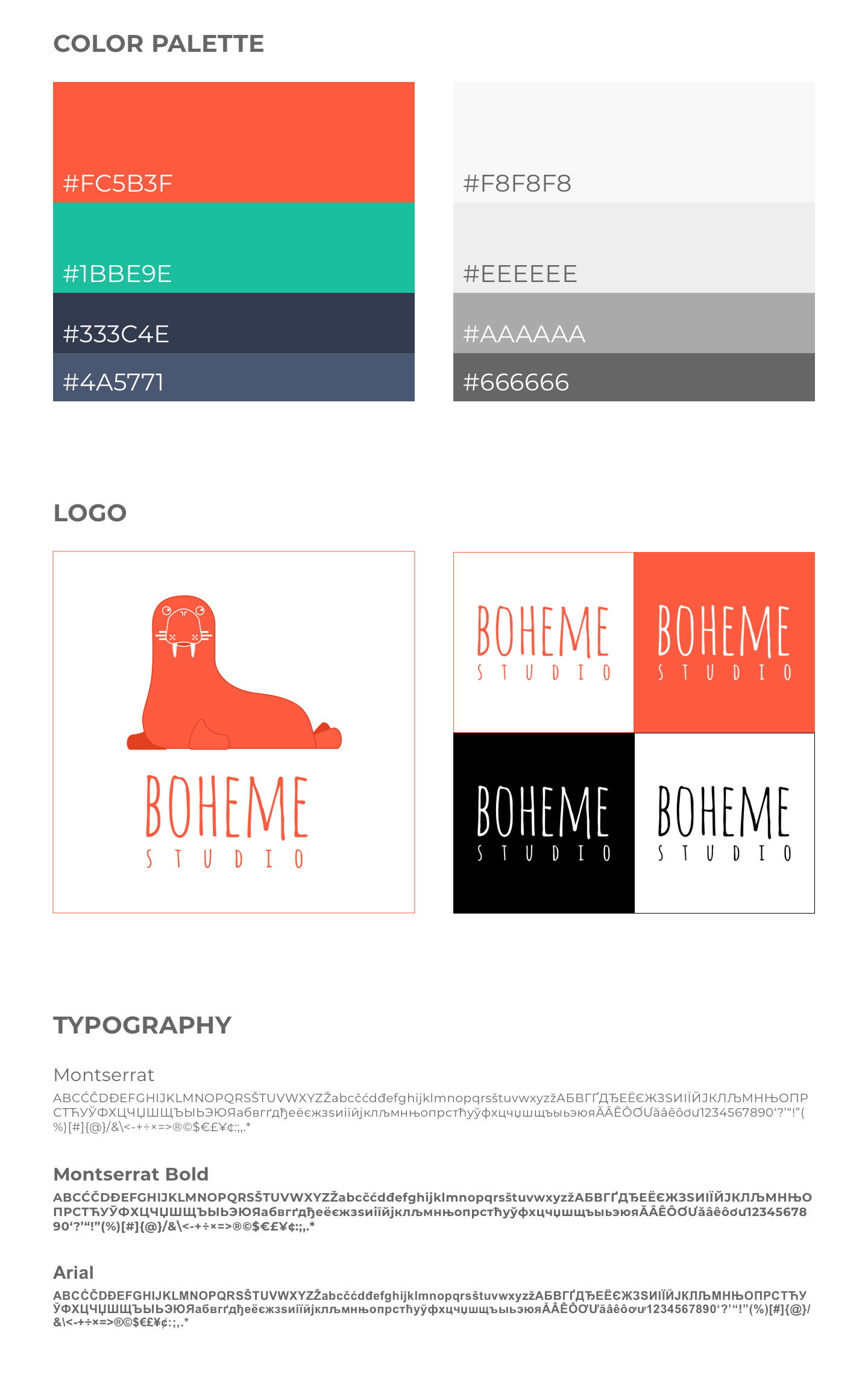
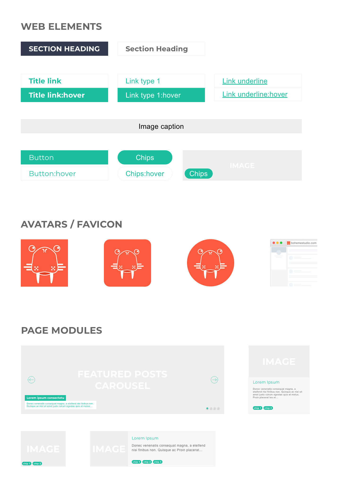
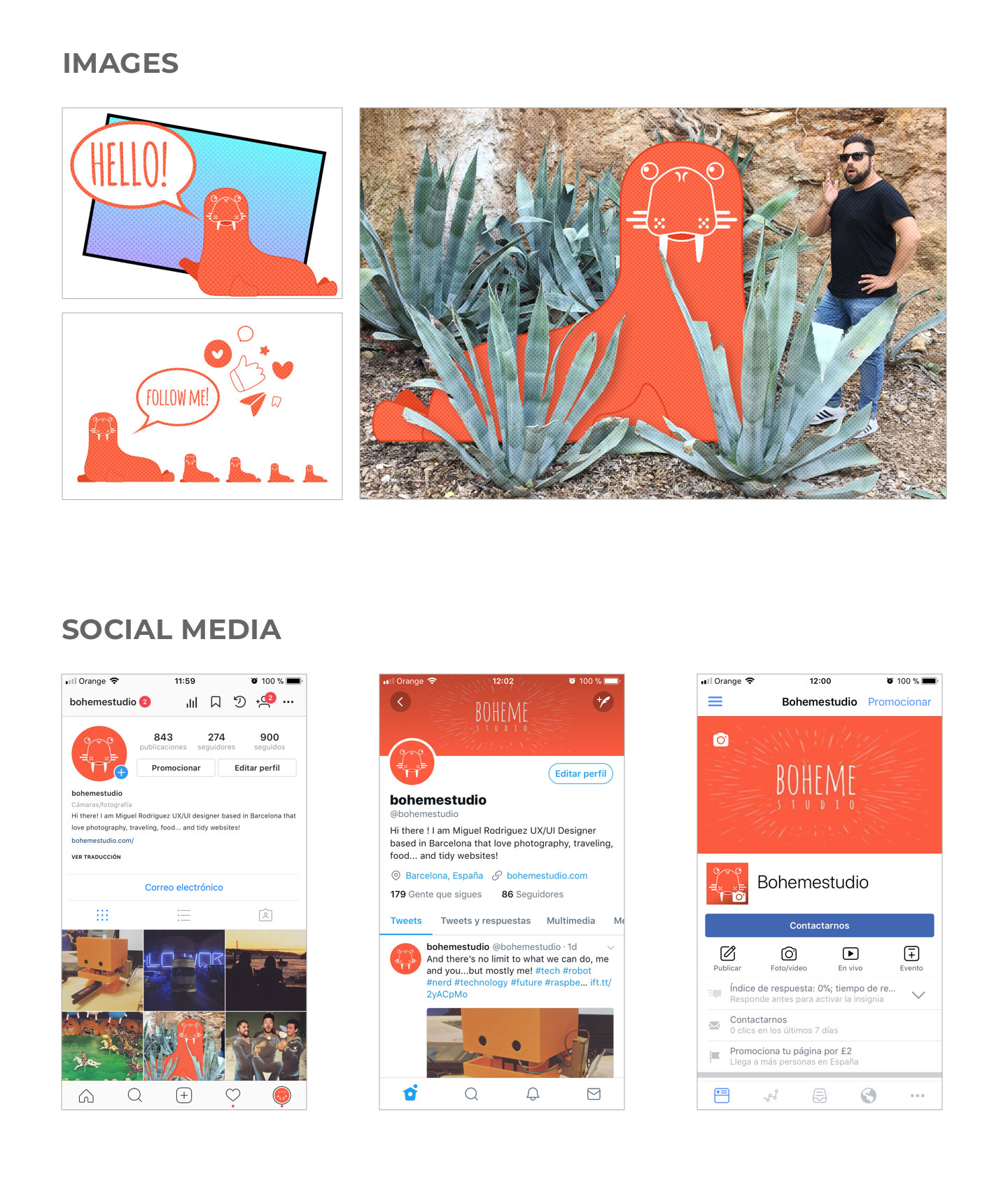
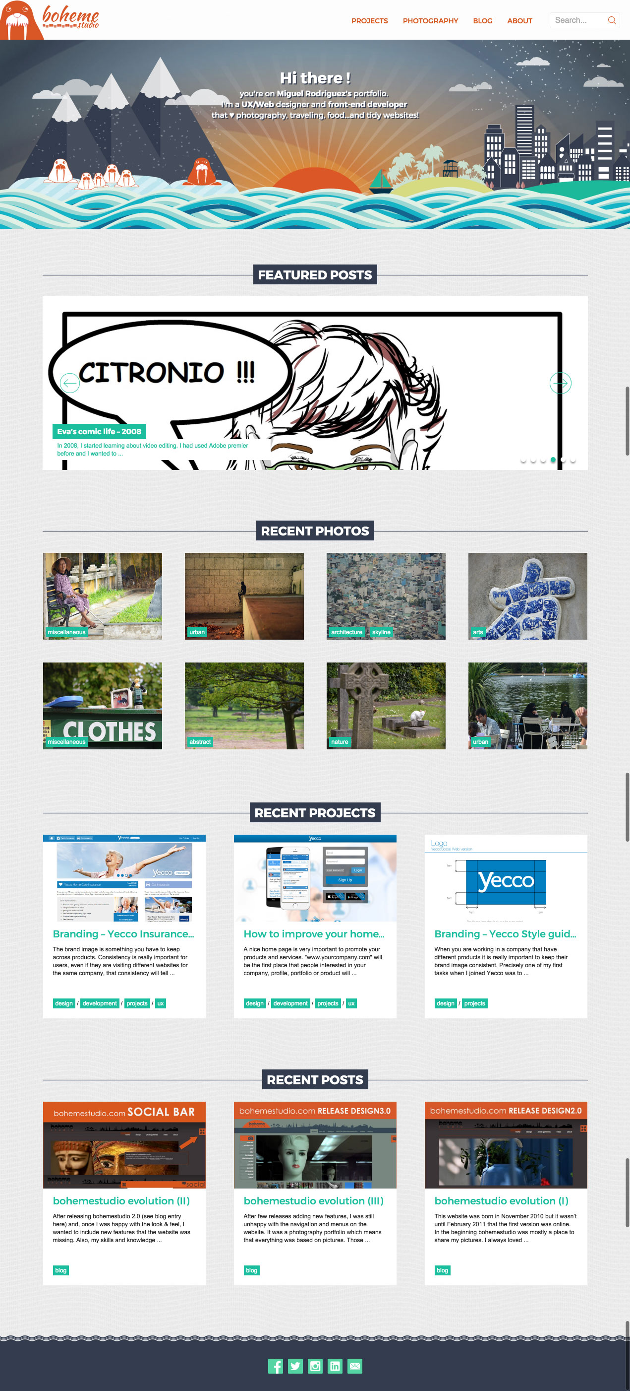
However I wanted to polish some details to offer a a lighter and a bit more elegant version of the website. Introducing rounding corners for chips, grouping posts info, making images wider and using a brighter primary colour and white backgrounds. The biggest change in this release is the new logo and mascot. A renewed walrus that helped me to redefine the logo, images and elements for social networks.
This is the final result, a brighter homepage that keeps the same interface with some touches in colour and elements that try to highlight the content. I hope you like it :)

