bohemestudio evolution (IV)
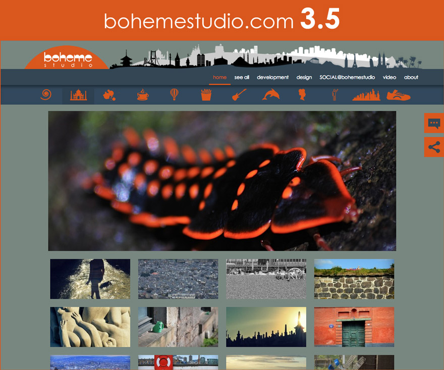
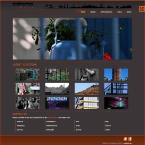
On November 2013 I launched bohemestudio 3.5. It wasn’t a whole new design for the website but it was a huge change at a technical level.
Important updates on HTML layout, CSS and Javascript optimization and the use of some of the new wordpress features to improve the performance of the website.
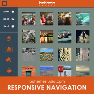
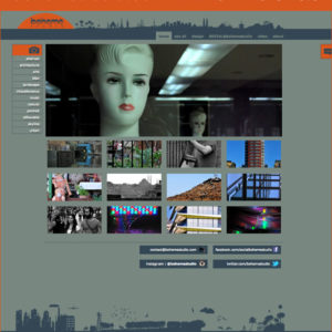
The gallery navigation menu was one of the visual changes in this release . A minimal menu with just icons was included in both desktop and responsive versions.
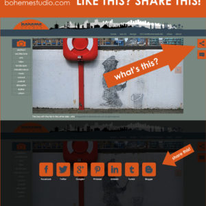
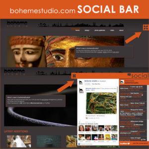
One of my targets was also to try making my visitors more active on social networks. So, I added a «share this» functionality to make it much easier to share my content on the main social networks.
- RESPONSIVE NAVIGATION (14Jan2014)
- LIKE THIS,SHARE THIS (17May2013)
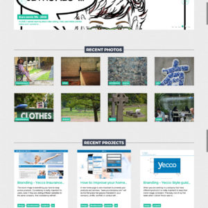
After 3 years online, more than 250 pictures were available on different galleries. My professional portfolio was also a lot bigger than the years before and I wanted to highlight that content. But, unfortunately the wordpress theme I was using was causing me too much trouble to create new posts about UX, Graphic design and Front-end stuff. To include a blog section was basically to build another website or just to start another wordpress theme almost from scratch.
When I checked the statistics of the website I realized that these galleries with my professional stuff were almost invisible to my visitors. A big change was coming!


