bohemestudio evolution (III)
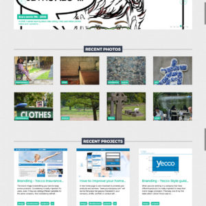
After few releases adding new features, I was still unhappy with the navigation and menus on the website. It was a photography portfolio which means that everything was based on pictures. Those pictures were the main content of the website but in some cases the galleries and categories were confusing.
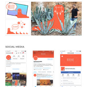
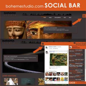
I also started to share some of my Front-end Developer / UX Designer work and to use the website as my professional portfolio. Even though the 80% of the content was my amateur pictures, bohemestudio became something I could show in several interviews when I moved to the UK.
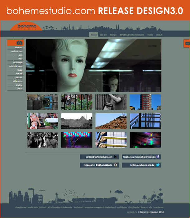
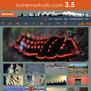
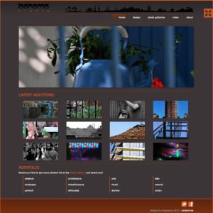
RELEASE DESIGN 3.0 (15May2012)
It was in the middle of 2012 that I started to work on a much brighter and cleaner new design for bohemestudio. In May 2012 I released bohemestudio 3.0 in which the major changes were the new colour palette and the improvements in the layout.
My priority with these changes was to get a proper responsive layout for different screen resolutions. It was very important for me to create a clean layout, a user friendly interface and more color contrast for mobile devices.
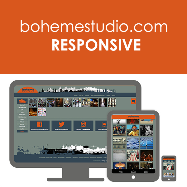
RESPONSIVE (13March2013)