bohemestudio evolution (II)
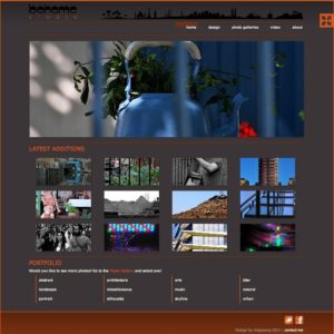
After releasing bohemestudio 2.0 (see blog entry here) and, once I was happy with the look & feel, I wanted to include new features that the website was missing.
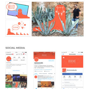
Also, my skills and knowledge about wordpress were growing as I was working on these features. This allowed me to include elements that made the website more usable such as Image galleries. I started sharing my latest graphic designs and pictures from my social network profiles on instagram and twitter.
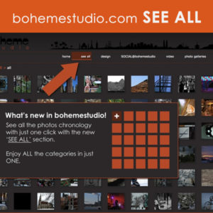
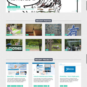
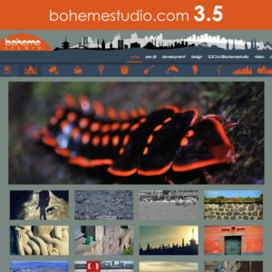
The feedback I received about my website was that some people were having issues trying to find pictures by category criteria, the navigation was not clear enough and that I definitely needed a «See all pictures» page.
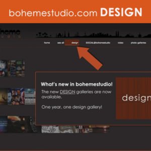
- DESIGN
- SEE ALL
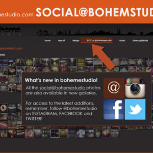
- SOCIAL
At that point the content was 95% of pictures so I decided to remove the search box and the archive index in order to encourage users to navigate through my galleries.
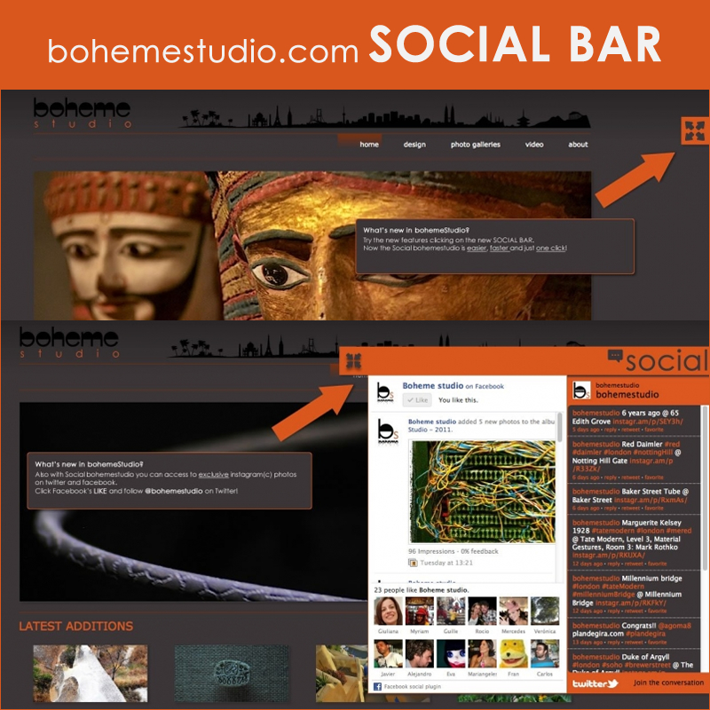
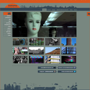
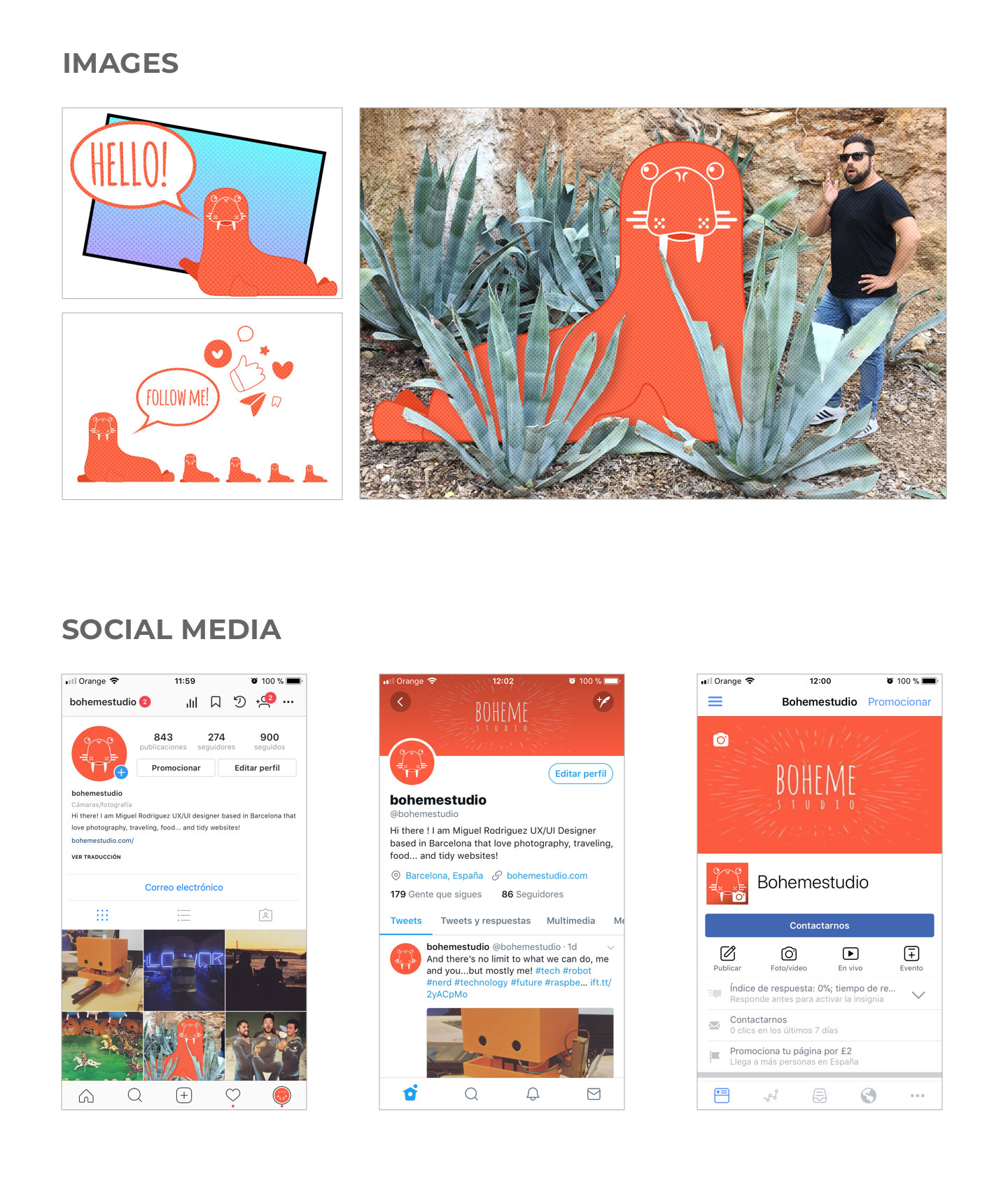
There was also a really important feature missing… I was promoting bohemestudio on social networks but the social networks were not fully integrated on my website.
My solution was to include a sliding block with the social content from bohemestudio’s facebook and twitter accounts.
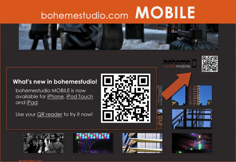
The next issue was that the website wasn’t responsive and mobile friendly at all! It didn’t look adapted for mobile devices. It was crystal clear that the next step was bohemestudio MOBILE.


